

Kung Fu Tea App Re-Design
Design Innovation Spring 2022
Tools Used: Figma
Role: UX Designer/UX Researcher
Duration: 8 weeks
Team Members: Sophia Ng, Pranav Saboo, Allison Oh, Sara Lin, Miranda Ma
Goal: We found many design problems with the existing app, our goal was to improve the user experiences and enhance the app.
Solution: Restructured the information architecture, and made changes to the visual design, without changing too much of the original design.
Problems with the current app
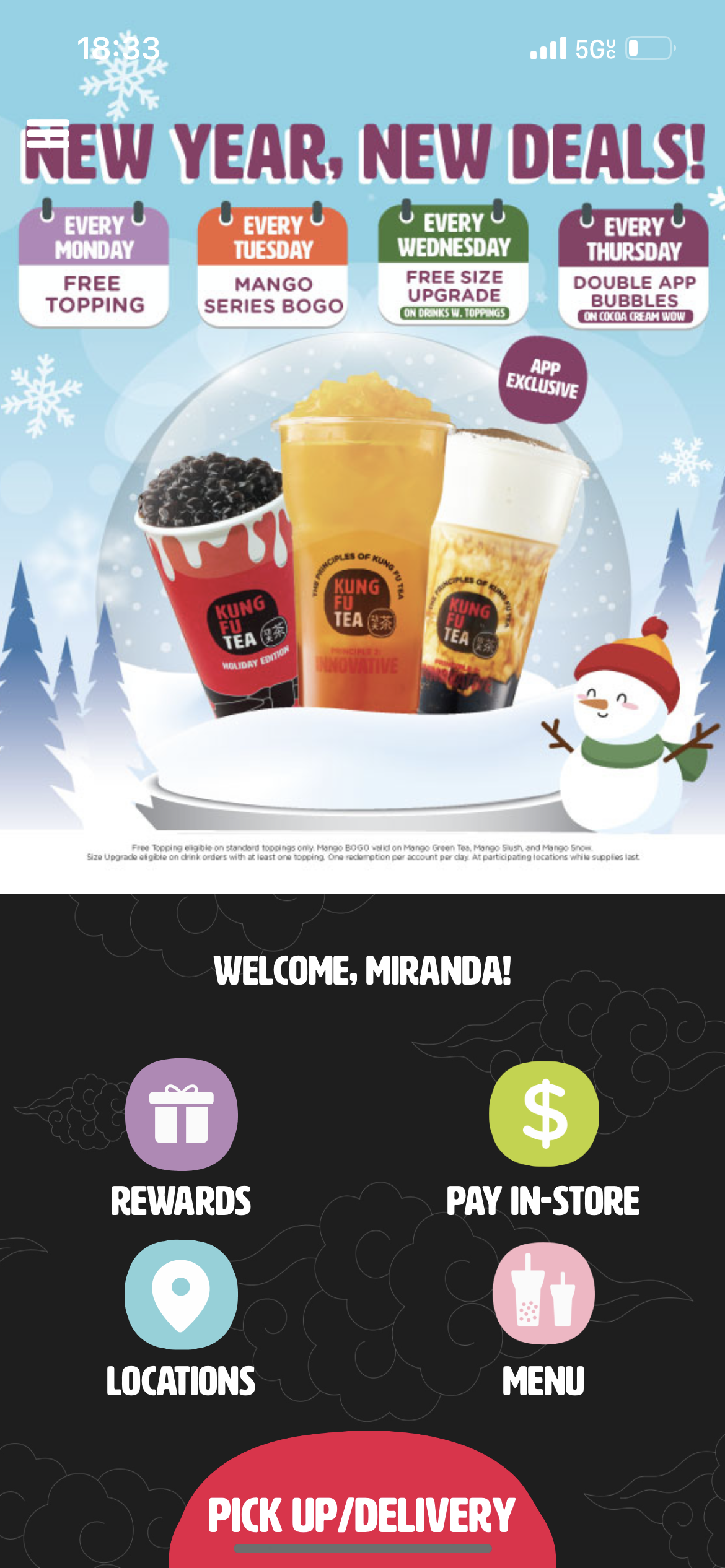

The home page was hard to navigate. The advertisements took up too much space and the remaining space for interacts are very limited.
Too many clicks to get from the menu to getting your order to the cart, no filters for sorting the drinks. Lack of search bar made the menu hard to navigate.

Competitive Analysis
We found some competing apps on the market that deliver similar services. We compared the current KFT app to the competitors to gage what they do well and gather inspiration for new designs.
Starbucks
Great navigation within the app, and originality when it came to design. The key feature we liked from the Starbucks app was their reward system. The overall usability of the app is high
Philz
The Philz app has great organization, there scrolling feature was unique and engaging but only works with a small menu. They do not have many features.
We started by conducting some user research!
We wanted to gather information from current users to pinpoint and narrow down the problem, to also gain feedback with their overall experience with using the app. The survey consisted of questions surrounding the purpose and interactions with the app. We got 76 responses and here are some of the finding!

65% Found the app confusing
50% wanted a search bar for better navigation
Visuals are important to enhance user experience and efficiency
Gathering this information we wanted to heavily consider the users and their needs. Having the least clicks to their final goal, which was ordering their drink of choice.
We listed down what features we wanted to include and what features we wanted to prioritize for the re-design.
Affinity Mapping

User Personas


Design Language

We picked out new fonts and a new color palette for this re-design. But we also wanted to maintain the essence and have roots of the original branding. We wanted to streamline and chose a more modern look for the direction of the re-design.
Information Architecture

We used FigJam to create the information architecture and the overall user flow of the redesign. Because we wanted to discard the hamburger menu, we added a navigation bar, with that we had to create new user flows to enhance the navigation and experience. This is the foundation for our redesign.
Lo-Fi Wireframes


Home Screen
An original problem we found is that the ads on the home screen took away too much of the interactive space. We wanted a section to still highlight the ongoing deals, but added more features that would be beneficial for the user. Such as an order again section, and having the users rewards right there on top.
We first designed lo-fi wireframes as the next, we wanted to map out what the final design are going to look like.
Menu Screen
The main problem with the original menu screen was the organization and how the drinks were categorized. We also added a search bar because it was one key thing that can automatically improve the user experience when sorting drinks.

Drink Customization
For drink customization we wanted to make something innovative, interactive, and original. We created a wheel system that is implemented for the drinks ice, sugar, and topping customization.

Let’s move on to hi-fis!


Sign In & Sign up
During the whole re-design process, we wanted to make sure we kept the original brand identity, and use the vibrant colors to their full potential. We made sure to utilize the color to better the user experience and navigation.
Starting off with logging in and signing up where it is the starting point for the user when they first use the app.


Homepage
We wanted to create a home page where it is easy to access all the essentials, the main thing we changed was we implemented a navigation bar instead of a hamburger menu. Based on our research, a lot of users order the same thing, and to make that more assessable we added the personal favorites on the homepage. There was also no search bar in the original app, and it was crucial to make the users experiences better.
Menu page
The menu page was one of the bigger changed in this re-design, because the original menu was hard to navigate, and users found it difficult to find certain drinks. We decided to categorize the drinks for easy access and it is more visually receptive for users. There are also filters for dietary restrictions. The food menu was also incredibly hard to navigate, and users were unsure of what each item is, there were very little customization abilities.


Ordering
The original app had a pretty standard ordering system, our team wanted to make a more interactive method to order and customize drinks. The options rotate to add on to the interaction and experience.


Rewards
With user interviews and research, we found out that a lot of users to not understand how the rewards system worked. Our goal is to make the rewards function easy to use and understand, and user to understand the full potential of the rewards system.

Profile
In the original app, to access the profile tab the user needed to go through the hamburger menu to access it. We wanted to make a separate section in the navigation bar for a profiles page, for easy access. The profile page allows users to access their past orders and their current promotion/rewards.
Goals
Improve navigation and the overall experience. To narrow down the areas where the app needs improving, and to find solutions to solve those problems.
Final Thoughts
Personal Reflection and Final Takeaways
This was the one of the first large scale UI/UX projects that I have been apart of/worked on. This project also exposed me to a lot of new experiences and learning opportunities, there were also so many technical aspects that I have never touched before. I learned a lot of basic about user research and interviewing, and I have applied those skills to my recent internship. This project also allowed me to familiarize myself with Figma and prototyping, prior to this project I have not had much experience with the platform.
The most difficult part of this project was to transition from the lo-fi to hi-fi. We had to find a balance between modernizing the original app, but also keeping the original brand identity.